4 Stages Of Data Analytics Maturity: Challenging Gartner's Model
If you happen to work in analytics, data science or business intelligence, you've probably seen one of the iterations of this Gartner's graph on stages of data analysis in a company:

The figure above shows various stages of analytics maturity, from "descriptive" to "prescriptive". I've seen it so many times, it became an eyesore to me.
There is nothing wrong with it. This look nicely breaks down the evolution of analytics into understandable parts and pairs each stage with a question to be answered: what happened, why did it happen, what will happen, how can we make it happen. And exactly this cadence of words what, why, what, how is what made me think that the relation between the 4 stages is not exactly linear.
In my mind, the what questions (descriptive and predictive analytics) can simply be answered by what's in the data: either existing historical data (descriptive analytics) or historical data, extrapolated into the future using machine learning techniques and forecasting (predictive analytics). You can easily move from one stage to another. There is no "diagnostic analytics" step in between.
Why and how (diagnostic and prescriptive analytics), on the other hand, are the questions that can be answered with existing data and a dash of business intelligence, either manual (a person going over the numbers and figuring things out), or baked in (an algorithm analyzing the numbers and producing verdicts based on models ran). In other words, both diagnostic and prescriptive analytics build on top of descriptive and predictive analytics respectively.
So, another way to visualize the connection between the four times would look something like this:

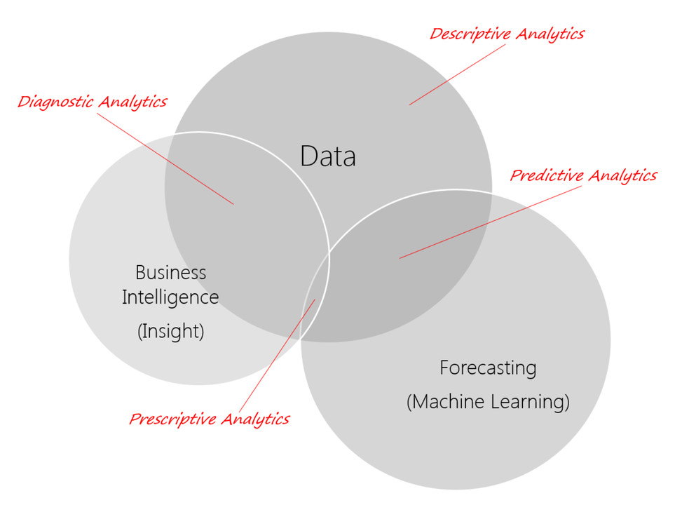
One issue with the following graph is that it doesn't fully show all the ways that data + insight + machine learning produce 4 flavors of analytics. And hence the good ol' venn diagram:

Every company's approach to analytics and data science is still unique: there are very few best practices known in the industry, and we all are still figuring it out. Similarly, every analyst's view on data analytics evolution and maturity will be different, and many of my colleagues will disagree with this view. And that is fine. We are still in the early stages of learning how to cook the proverbial spaghetti, and therefore let's not rob ourselves of the joy of throwing stuff from the pot onto the wall and seeing what sticks.
Supporting change in complex systems and organisations. Being the glue between people, process and technology. Using data to understand the world IRL. #DataIsBeautiful
1yThis was recently shared with me, I feel it’s a great way to think about how the data can support the various way to use it. It’s good to challenge a linear way of thinking.
Data Analyst | Data Scientist & ML Engineer | Mechanical Engineer
1yVery insightful
Innovation Team Leader | AI community Leader | Digital Transformation
3yGreat, visual and easily understandable.
Sr. Manager Data Visualization at Ovative Group with expertise in Data modeling, Data Visualization and Analytics.
4yVery useful article Taras K.
Data Science - Research Consultant - Center for Surgical Science
4yGreat article and visual! Quick Venn question: how can we do forecasting and ML without data?