Taras Kaduk
Cities with Best (and Worst) Weather, 2021 edition
An analysis of NCEI GSOD weather data with a subsequent ranking of World and U.S. cities in terms pleasant weather. Count of pleasant days and calculation of excess degree-days are used as two different approaches, returning similar (yet not identical) results.
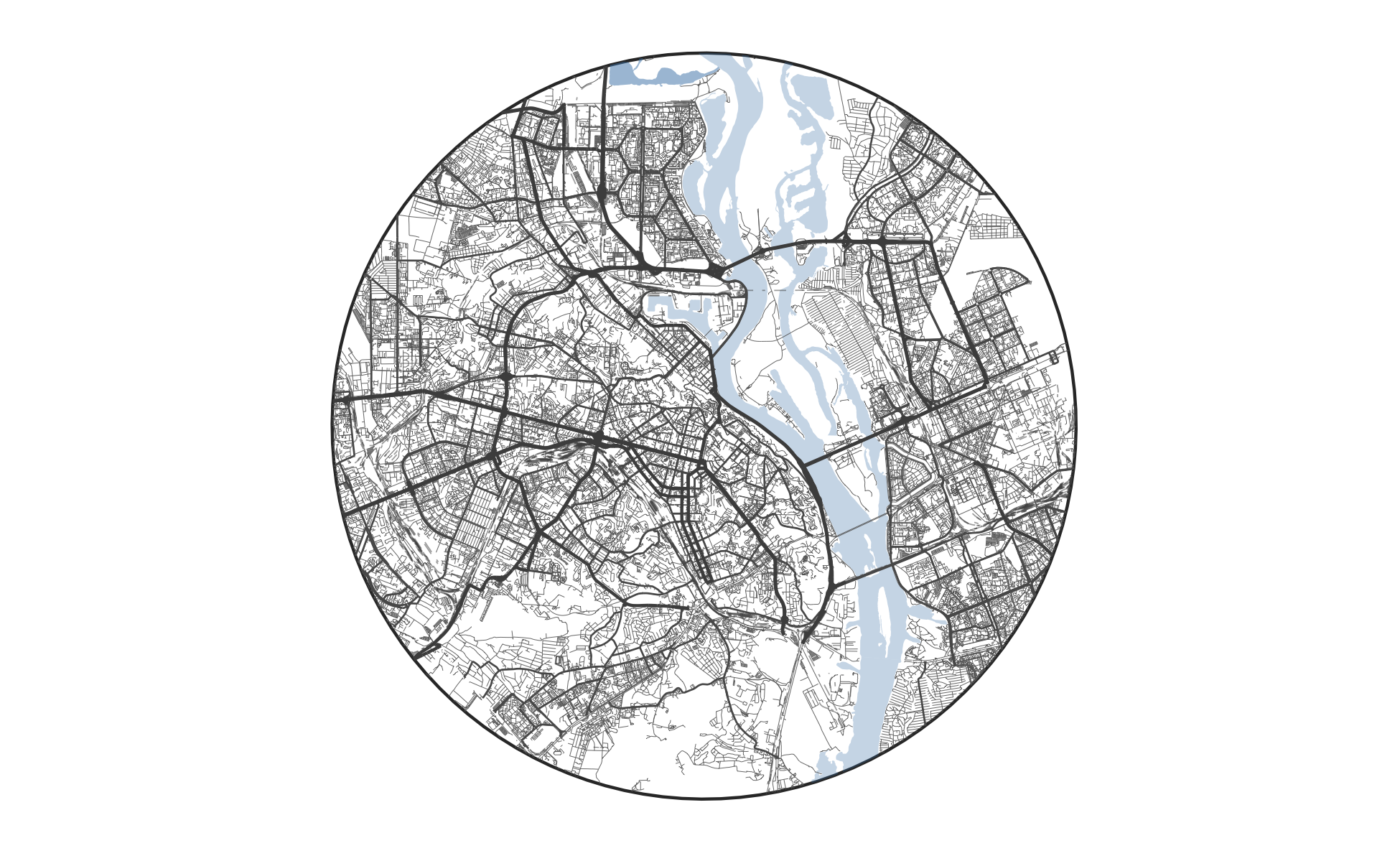
Print Personalized Street Maps Using R
A code walk-through of how to generate streets maps in R using {osmdata} and {sf} packages. Initially published on 2019-12-19 and updated on 2020-01-18.
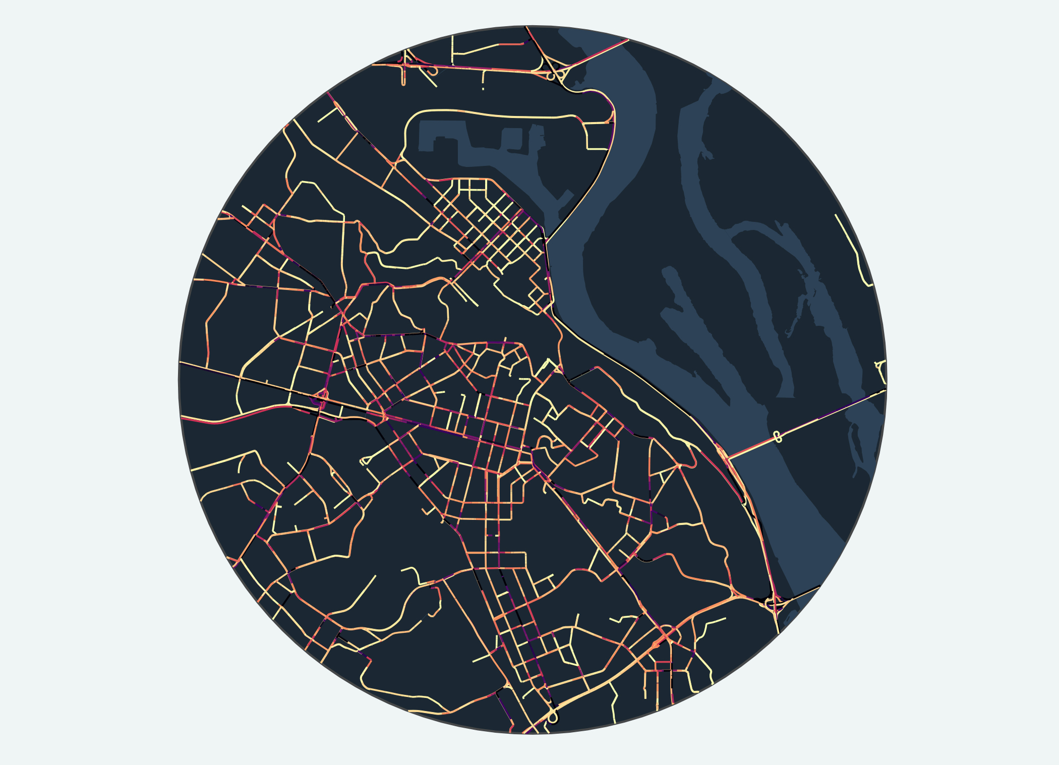
Analysis of Kyiv Road Traffic Using Uber Movement Data
This analysis uses Uber Movement speed data to analyze traffic of Kyiv, Ukraine. By looking at the speed data, we are able to find traffic flow's bottlenecks, as well as see the impact of COVID-19-related measures on the city traffic
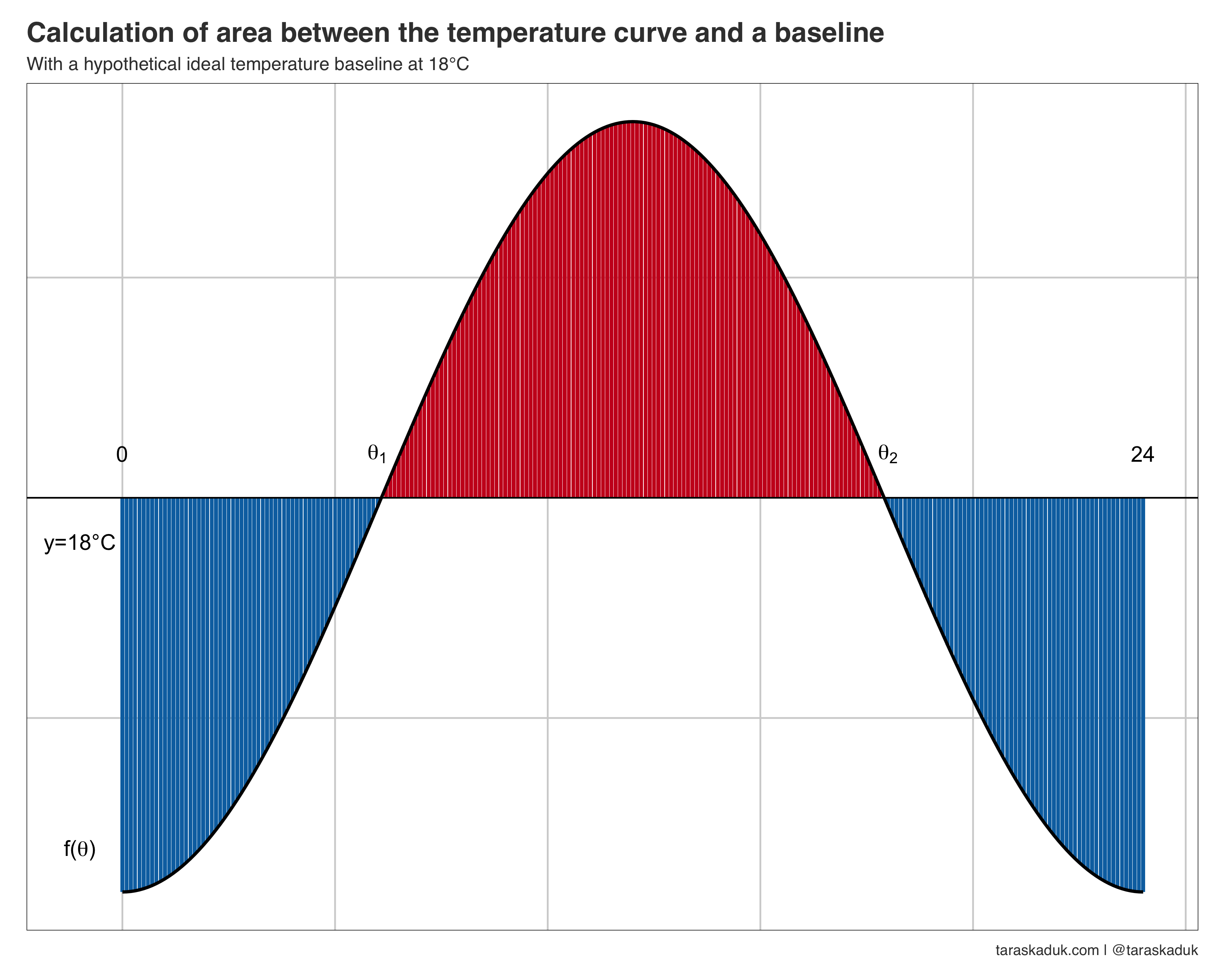
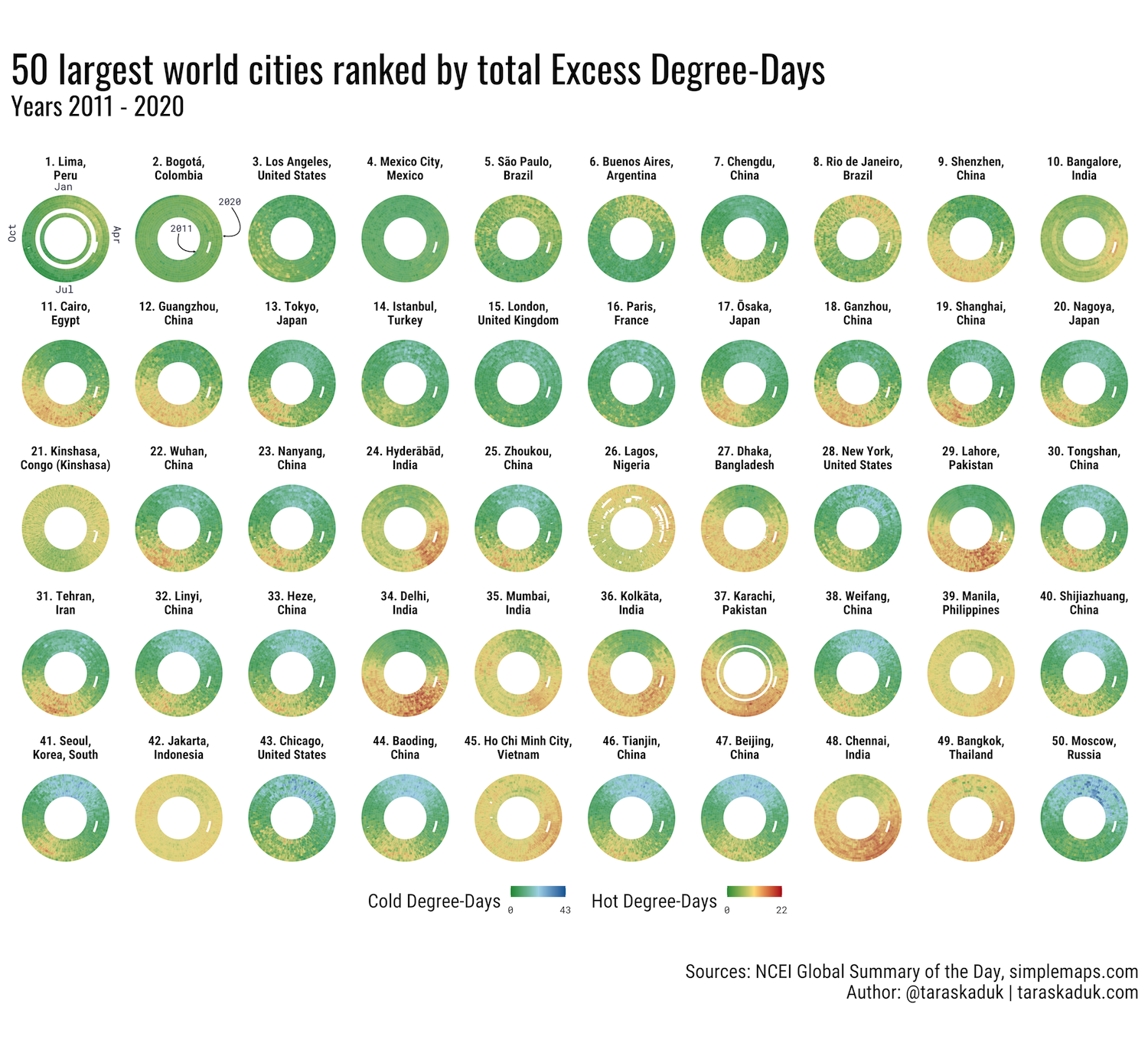
Measuring Excess Degree-Days in the Context of Location Comfort and Liveability
Calcualting deviations (excess heat and excess cold) from an established temperature baseline as area under the temperature curve via integral calculus and expressing such measure as Excess Degree-Days, or EDD.
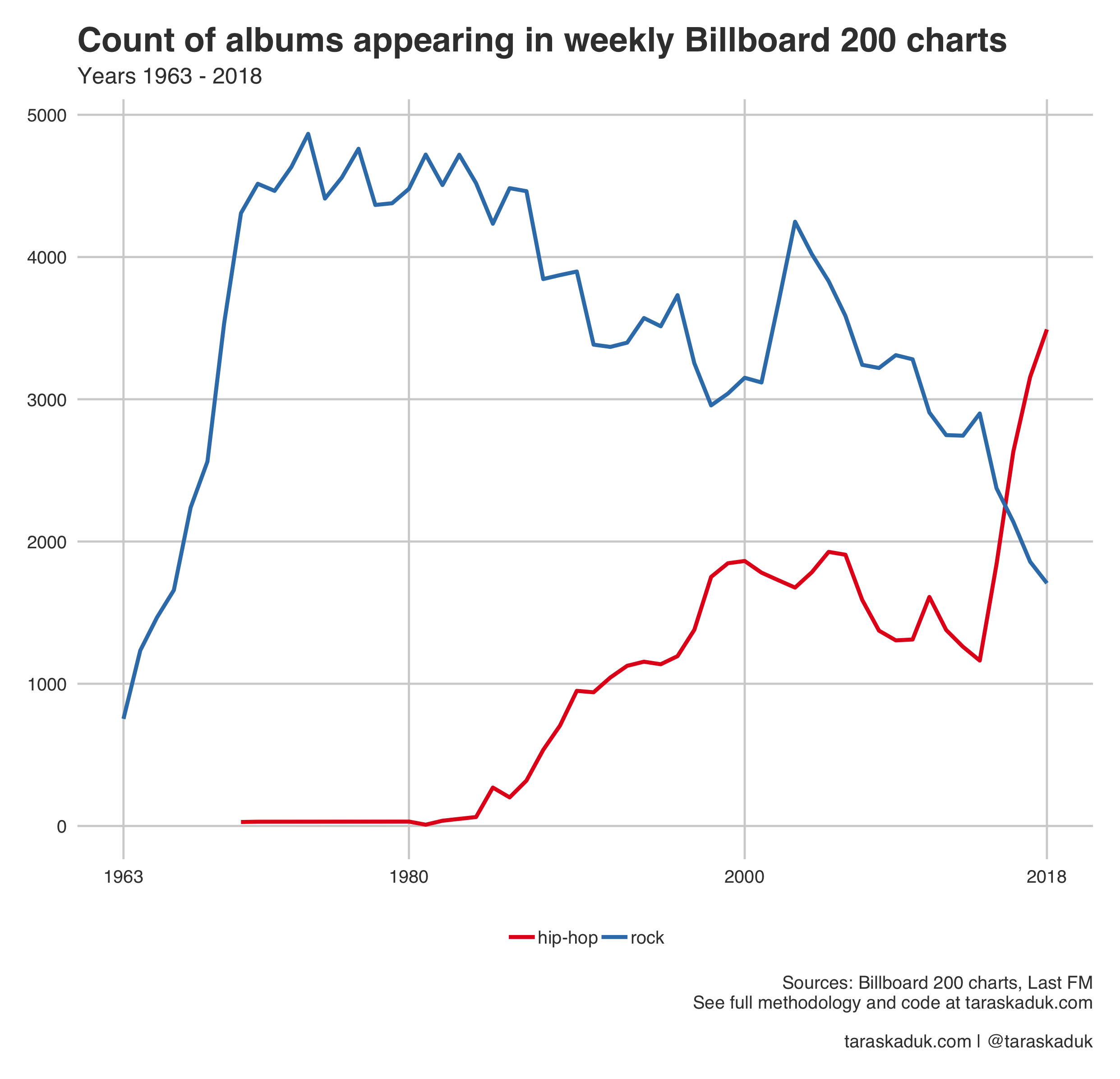
Is Rock Dying?
A quantitative comparison of artists in the Billboard 200 charts 1963 - 2018. A comparison of rock and hip-hop artists show a decline of the former and the rise of the latter

Analyze and visualize your iPhone's Health app data in R
Learn to import, analyze and visualize your Health app data in R
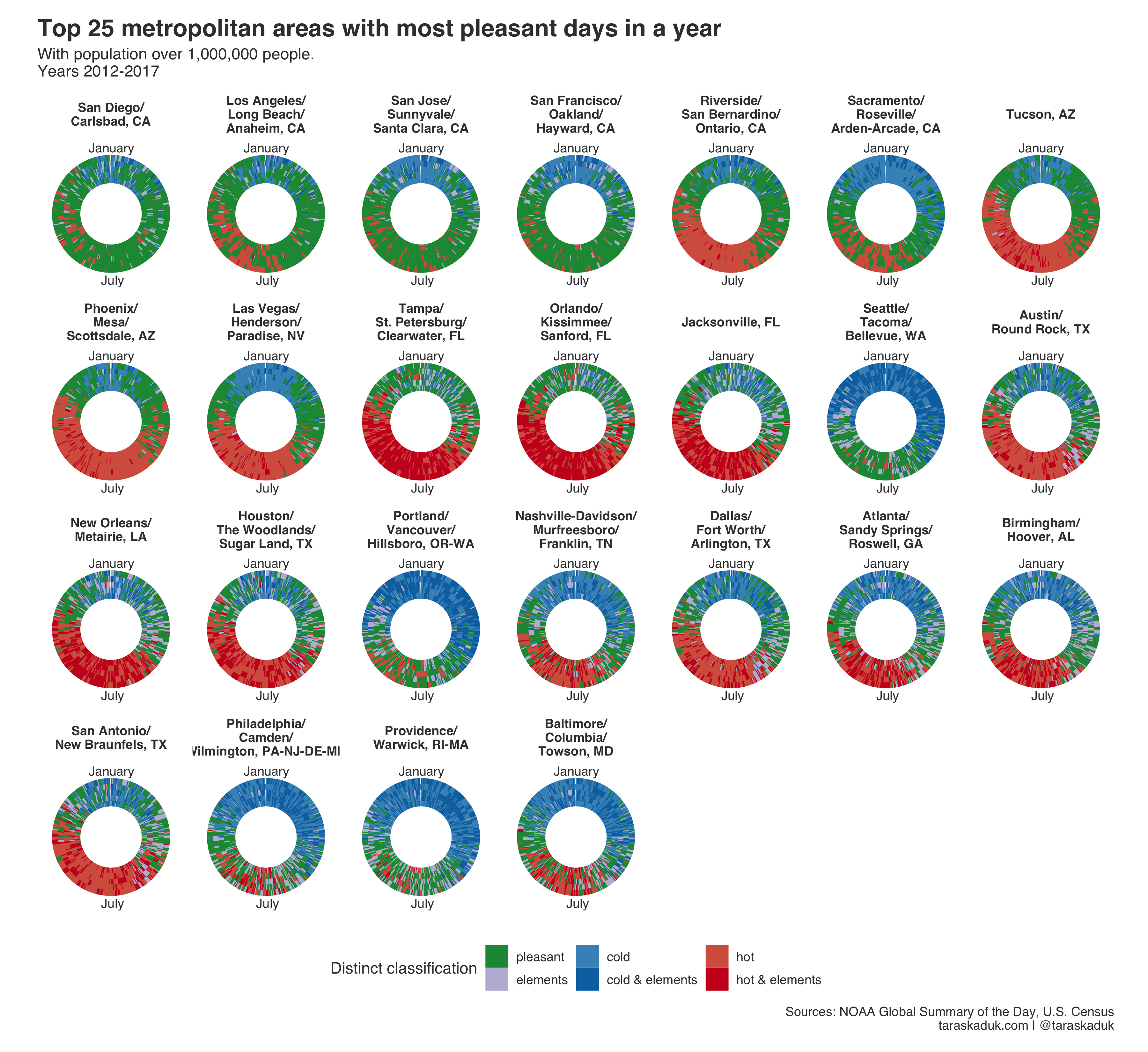
Where are the places with the best (and the worst) weather in the United States?
Using NOAA GSOD data in determining the amount of pleasant days in USA's core-based statistical areas

Power Query: Excel's gateway to reproducible analysis
Review of Power Query's scripting language as a way to evangelize reproducible data analysis and programming with minimal learning investment

Create World Pixel Maps in R
A walk-through of generating personalized pixel maps with R from scratch.

Do MPAA movie ratings mean anything?
Investigating the movie ratings and and their content. With R.